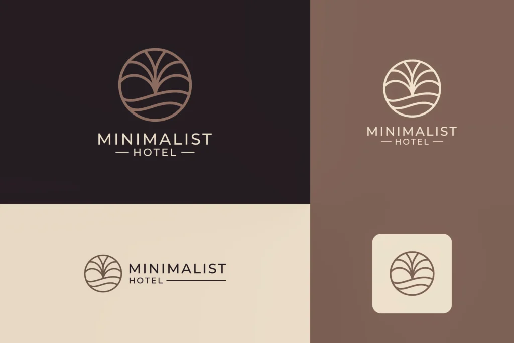
“We need a new logo.”
It is one of those sentences that can mean almost anything. Sometimes the hotel really does need a new identity. The business has changed, the property has been renovated, the old identity belongs to a previous phase of its history, or the hotel has moved into a completely different market. In those cases, redesigning the brand can be the right thing to do. But quite often, the logo is simply the most visible part of a much less visible problem.
The website doesn’t convert as well as expected. The hotel looks increasingly similar to its competitors. Guests don’t seem to understand what makes the property different. The owner feels that the hotel deserves a stronger reputation than it has. The price has gone up, but the brand still feels stuck somewhere in the past. And because the logo is sitting there, on every page and every sign, it becomes an obvious suspect.
Change the logo. Change the colours. Change the typography. Redesign the website. Make everything look more sophisticated.
Maybe that will help, but what, exactly, is the new identity supposed to communicate?
That question tends to arrive much later than it should.
A hotel can look completely different and still mean exactly the same thing
Imagine opening the websites of two boutique hotels you have never seen before.
Both have beautiful photography. Both use natural materials and muted colours. Both talk about authenticity, local experiences, personal service and a strong connection with the destination. Both have carefully designed rooms and a small number of keys. Both describe themselves as unique.
Now imagine that one of them changes its logo.
The typography becomes more elegant. The colour palette becomes more refined. The website gets a cleaner layout. The photography becomes more editorial.
It looks better. But if you remove the logo from the equation, what has actually changed in the proposition?
This is the uncomfortable part of hotel branding: visual distinction and market distinction are not the same thing.
A hotel can have a distinctive visual identity while communicating exactly the same basic promise as everybody else. And the opposite is possible too. A hotel can have a fairly unremarkable logo and still occupy an extremely clear position in the mind of its guests.
The logo is not irrelevant. It is simply not doing the job people often expect it to do.
The problem usually starts before the designer gets involved
A designer can make an identity more coherent, more recognisable, more appropriate and more distinctive. But the designer needs something to work with.
If the brief is “make us look more premium”, what does that actually mean?
Does premium mean quiet and discreet? Does it mean exceptional service? Does it mean design? Does it mean exclusivity? Does it mean a particular kind of guest experience? Does it mean that the hotel should feel more expensive than its competitors, or that the guest should understand why it costs more?
These are completely different things and they produce completely different brands.
This is why whether your brand gives guests enough reason to pay a premium is part of the same discussion. A hotel cannot create perceived value simply by adopting the visual codes associated with expensive brands. The guest still needs to understand what the premium represents.
If “premium” is only an aesthetic direction, the designer can make the hotel look premium. That doesn’t mean the hotel has become better positioned.
Positioning is the part of the brand you cannot see
This is probably why it gets neglected.
You can open a brand guidelines document and see the logo. You can see the colour codes. You can see the typefaces. You can see how the photography should look.
Positioning is more difficult to put on a page. It is the set of choices that determines how the hotel wants to occupy a space in the customer’s mind. It is about relevance, differentiation, audience, alternatives and value. And those choices have consequences.
If a hotel decides that it wants to be known primarily for an intimate, highly personal experience, it cannot then communicate like a large resort simply because the resort’s marketing looks successful.
If the hotel’s strongest proposition is its relationship with a particular destination, that relationship should have more weight than a generic list of amenities.
If the hotel is trying to attract travellers who value privacy and tranquillity, it doesn’t necessarily help to communicate twenty different activities simply because the property happens to offer them.
Positioning creates hierarchy. Without it, everything tends to become equally important. And when everything is important, the brand becomes difficult to remember.
This is where the logo gets asked to do too much
When there is no clear position, the visual identity often becomes a substitute for strategy.
The hotel wants something that will make it feel different.
So the logo becomes more distinctive.
Then the website needs to match it.
Then the photography needs to be more distinctive.
Then the social feed needs to look more premium.
Then the hotel discovers that its competitors have also adopted beautiful photography, sophisticated websites and distinctive identities.
So it starts again.
There is nothing inherently irrational about any of these decisions. Visual identity matters. Photography matters. A website matters. The way a hotel presents itself influences expectations. But all of these things are downstream from a more fundamental decision.
What should people actually remember about this hotel?
Not what should they remember about the logo.
The hotel.
That is a different question.
Boutique hotels have a particular problem here
The boutique category has spent years moving away from the visual language of conventional hotels, which was probably necessary.
But now a different kind of sameness is emerging.
You see it in the interiors first: natural materials, soft colours, handmade objects, plants, linen, local craftsmanship, carefully imperfect finishes. Then it appears in the photography: breakfast on a wooden table, someone reading by a window, a glass of wine at sunset, a close-up of a texture, a beautifully made bed. Then in the language: authentic, local, intimate, unique, curated, soulful, slow, personal.
Again, none of these things are necessarily false.
The problem is that they have become part of the visual and verbal vocabulary of the category.
So a hotel can spend a great deal of money making itself look distinctive and end up looking exactly like the kind of hotel it was trying to distinguish itself from.
This is one reason the question of why guests should have a clear reason to choose your hotel comes before the question of how that hotel should look.
If the reason isn’t clear, visual differentiation can only go so far.
And sometimes the hotel really does have a strong position
This is where I would be careful with the usual branding advice.
Not every hotel with an old logo has a positioning problem.
Sometimes the position is perfectly clear. The guests understand it. The reviews reinforce it. The experience delivers it. The hotel has a good reputation and a loyal audience.
The logo may simply be bad.
Fine.
Redesign it.
There is no strategic virtue in keeping an ugly or outdated identity because “the logo isn’t the brand”.
Of course it isn’t. But neither is there any strategic virtue in redesigning a perfectly adequate identity because the hotel has not solved a completely different problem.
The question is not whether the logo matters. The question is what problem are you trying to solve?
That should be the starting point of any serious rebranding project.
A new identity cannot decide who the hotel is for
This is another area where hotel owners can accidentally make the design brief impossible.
They want the hotel to feel sophisticated but welcoming. Exclusive but accessible. Local but international. Relaxed but premium. Romantic but suitable for families. Contemporary but timeless.
Every individual characteristic may sound attractive. Put them all together and the brand has nowhere to stand.
A position requires a degree of exclusion. Not necessarily exclusion of guests, but exclusion of meanings.
If everything the hotel can offer has to become part of the brand, the identity becomes a catalogue. The hotel can still offer all those things. It just doesn’t need to build its identity around all of them.
That is one of the hardest parts of positioning because hotel owners naturally see the full picture. They know every room, every service, every detail, every improvement and every story behind the property.
The guest doesn’t have that information. And they don’t need it. They need to understand enough to decide whether this is the hotel they want.
Your visual identity becomes much more useful once the decision has been made
Once the positioning is clear, the role of design changes.
Now the designer has something to translate.
The question becomes whether the visual language feels appropriate for the audience, whether it reinforces the personality of the hotel, whether it helps create the right expectations and whether it makes the proposition recognisable across different touchpoints.
Photography can become more selective. The website can give more space to the things that actually differentiate the property. The tone of voice can become less generic. The identity can create associations rather than simply trying to look attractive. And the logo can finally do the relatively modest job it was always supposed to do: act as a recognisable identifier within a much larger brand system.
That is not a small job. It is just not the whole job.
The real test happens outside the logo
There is a simple way to understand whether the branding problem is actually visual.
- Remove the logo.
- Now look at the homepage.
- Look at the photographs.
- Read the first few paragraphs.
- Look at the room descriptions.
- Read an enquiry response.
- Look at the quotation a potential guest receives.
- Look at the booking process.
- Read the hotel’s reviews.
- Imagine arriving at the property.
Does the same idea keep appearing? Does the hotel feel like the same hotel throughout the journey? Or does the identity promise one thing while the rest of the experience communicates something else?
This matters because the gap between what a hotel promises and what guests actually experience can be much more damaging than an outdated logo.
A beautiful new identity cannot compensate for a brand promise that disappears as soon as the guest moves from the homepage into the actual booking process.
In fact, sometimes a redesign makes the problem more visible because the front end becomes more sophisticated while everything underneath remains unchanged.
The hotel now looks like the brand it wants to be. It just doesn’t behave like it yet.
There is also a financial problem with getting this backwards
A visual rebrand is tangible.
You can commission it, approve it, launch it and see the result.
Positioning is less satisfying because it requires decisions before anything looks different.
There may be workshops. Research. Competitor analysis. Guest interviews. Difficult conversations about who the hotel is actually trying to attract. Decisions about what to stop saying. Decisions about what makes the hotel genuinely different rather than merely better.
None of that produces an impressive presentation on day one. But it can prevent the hotel from spending a considerable amount of money making the wrong idea look very good. And that is the real danger.
A weak positioning wrapped in excellent design can be harder to challenge internally because it looks finished. Everyone can see the improvement. Nobody can easily point to what is still missing.
The logo should follow the change, not pretend to be the change
When a hotel genuinely repositions itself, the visual identity may need to change with it.
That makes sense.
A property that has moved from traditional family hotel to design-led boutique hotel may need an identity that reflects the new reality. A hotel that has shifted from broad leisure tourism to a much more specific audience may need to communicate differently. A property that has evolved substantially over ten years may simply have outgrown the identity it started with.
But notice the sequence.
The business changes.
The position becomes clearer.
The brand needs to express that new position.
Then the visual identity changes.
That is very different from starting with a logo because the logo is the easiest thing to change. The difference may seem subtle. It isn’t.
Before you redesign, ask what the hotel is actually trying to fix
If the hotel is not being chosen often enough, a new logo is unlikely to be the first thing I would investigate.
If the hotel looks interchangeable with its competitors, I would want to understand the difference between being different and being well positioned.
If the hotel attracts the wrong guests, I would look at the proposition and the audience. If the hotel charges a premium but struggles to explain the value, I would look at the relationship between price, positioning and perceived value. If the guest experience contradicts the promise, I would look at the entire journey. And if, after all of that, the identity is still failing to represent the hotel properly, then redesign the logo.
There is no reason not to.
Just don’t start there because it is the easiest problem to see.
A hotel does not become well positioned because its logo is distinctive. It becomes well positioned when the right guest can understand what it is, why it matters to them and why they should choose it over the alternatives.
The logo can help make that idea recognisable. It cannot create the idea for you.
Fix the positioning first. Then decide what the logo needs to say about it.